
Choosing the right colour to paint your much loved summer house can be problematic. The last thing you want to do is pay out a small fortune on paint, spend half a day studiously decorating, and then discover your choice of colours doesn’t work. The wrong shade of green could make your summer house disappear into the surrounding plants. Pick a bright colour to help it stand out, get the wrong shade, and you could end up with an eyesore.
To help you pick the best summer house paint colours we’ve selected photos showing real customer summer houses in a range of different colours.
1. Why paint your summer house?

There’s a practical element to painting a summer house or any other timber garden building: it gives protection from the weather, insects, mould and fungus. Even if you opt for a dip treated summer house, we recommend that all our timber buildings are finished with paint or varnish as soon as they are constructed.
But practicality is just the start of it. You can use the colour scheme of your summer house, shed or garden room to say something about yourself, complement certain aspects of your garden, help the building blend into the background or make it a focal point of your garden design.
2. Choosing a summer house paint colours

A dash of paint can be the difference between a traditional English-style summer house and a contemporary garden office. It can conjure up the beach, a Nordic forest, the Scottish Highlands, some urban cool, or leave the eye free to focus on the plants around it.
And for those who already own a summer house, a paint job is a relatively hassle-free way to transform or revive an ageing garden building.
Obviously, that’s empowering; it’s also a bit daunting. Given the power of colour to transform, where on earth do you start?
3. A few basics about choosing a paint colour for a summer house
The ‘classic’ summer house paint scheme is to have the walls in a darker shade, and the doors and windows a lighter shade – white, cream, or a paler shade of the wall colour.
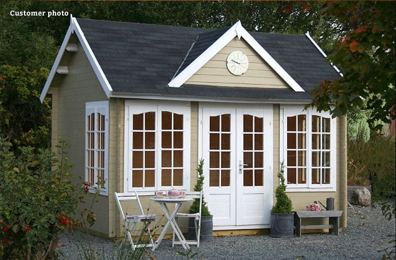
Greens, beiges and greys work well with this format, as do a wide variety of styles and sizes of building. A great example is the beige and crisp white scheme one of our customers used on a traditional clockhouse garden building, which has been nicely enhanced with garden furniture and topiary.
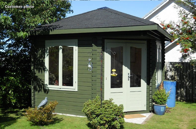
For a darker colour scheme, look at the dark/light combination on this Melanie corner summer house. The olive-green walls help it blend with rest of the garden, whilst the blue plant pots add a dash of colour.
4. Bold and bright Summer house paint colours
The darker walls / lighter trim approach works well with bolder colours too. You’re making more of a statement, but still not breaking any rules. Blue and white gives a good nautical or vintage feel, and colour contrast also helps to highlight the excellent design, build and features of a summer house. Take a look at:


We love both these shades of blue, which give a Mediterranean feel in summertime, and inject some cheer in the autumn and winter months, without looking out of place against greyer skies. See how a blue roof can add to the effect.
Another popular colour with our customers is dark red or burgundy. Take a look at these two beauties, both with a distinct Nordic style – one looks like an enviable island summer house, the other is straight out of an enchanted forest. In both cases, the lighter doors and windows add definition.


5. Use just one summer house paint colour
Another option is to use the same colour throughout and it’s interesting to see the different effects this can achieve. Generally, a single colour makes a summer house merge with its surroundings more – though of course it depends on the colour. Pink walls and window frames certainly don’t disappear into the background – however vibrant your garden.
This octagonal Hanna summer house has been painted an attractive pale green which blends with the surrounding garden – it’s certainly not camouflaged or invisible, but it’s not saying ‘Admire my fine door and window features!’ either.

6. Using neutral summer house paint colours
You can take this blending effect a step further with neutral colours, and we particularly like two customer examples of this. First is a modern, white garden room that pulls your eye towards the horizon and lengthens the garden. Lighting inside and out adds warmth to the stripped-down design, and we would happily spend many a day there.

We would also happily while away the summer in this Veronica pavilion and the beautiful garden that surrounds it. With a natural dark wood stain throughout, the structure almost disappears into the surrounding garden. Windows on all sides of the summer house mean the garden is visible from every angle.

7. Stain or paint a summer house with colour?
This brings us onto another basic ‘rule’ about colour – that using stain rather than paint allows the natural grain of the wood to show through. And stain doesn’t have to be brown. Using a pale limewash-effect stain can give a vintage feel, or you could go bolder in your colour choices, as with this Hanna summer house.

Using a stain makes the colour less ‘in-your’ face than paint, and more rustic – not so great if you were looking for a more urban effect.
8. Summer house paint colours for modern living
If you’re after a more modern or urban feel for your summer house paint colour choice, matte paint is a good bet. Greys, black, charcoal, or the dark, dark greens and midnight blues that you see on front doors in Amsterdam make a good colour palette here.
These colours make even a traditional summer house look more twenty-first century, and work very on contemporary designs too. A contrasting white or grey trim will catch the eye, as can a reversal of the usual dark/light principle – so you have pale walls and darker doors and/or windows.


9. Adding summer house colour through accessories
Finally, a word about accessories and touches of colour. Borrow a great tip from many a boutique hotel, and use a grey palette (or other neutrals) for walls, floors and doors and add touches of bright colour (eg inspired by flowers and other plants) for anything from cushions to garden furniture to plant pots.

10. Keep things flexible
As well as adding sophistication to the overall look, the ‘boutique hotel’ approach is practical – you can keep the neutral backdrop to your summer house unchanged, and change the accessories to alter the look. A pale-grey Japanese-inspired garden room with minimal decoration could transform into a seaside theme with the addition of some blues, and stripes and different furniture.